Saturday, September 19, 2015

LARA CROFT - Tomb Raider "The Cradle of Life" Angelina Jolie "Wetsuit" Statue


My collectible interests come and go, often in fits and bursts. The length of those bursts varies greatly (I had a strong two months of intense dinosaur collecting, while my Godzilla phase lasted nearly 15), with a very small group of exceptions: those things I seem to always come back to. Amongst them are Batman, Darth Vader and Lara Croft. I never played the original Tomb Raider games, but I was aware of the character. I saw, and mostly enjoyed, the first movie. I even find the sequel, "The Cradle of Life", to be fairly entertaining (if I don't stop and think too much), and I think Angelina Jolie seemed to really step into the role much more solidly. That was about the extent of my Tomb Raider experience. Nevertheless, I had accumulated quite a decent collection of figures.

I have figures from Toy Biz, Playmates Toys, SOTA and NECA, and I like them all in their own ways. My recent completion of the 2013 Tomb Raider reboot shot a new charge into my Lara Croft interests, and I've added Play Arts Kai's version, as well as the Gaming Heads "Survivor" statue (reviewed on this blog) to the collection. Which brings me to the subject of this review: the "Wetsuit" statue from "Cradle of Life". I have all of SOTA's movie figures (there were only 3), and I think they are some of the very best, most complete Tomb Raider action figures ever made, combining excellent sculpts with adequate paint and articulation to give me the most posable Lara possible (in theory, that is - much like the PAK version, I can't get the articulation to work as well as I'd like). That said, I never ventured into the SOTA statue realm. I've been aware of this statue for a decade, and I've never quite taken the plunge. The price was just higher than I was willing to go, for something that didn't quite capture Jolie as well as I'd like.

That all changed when I caught I decent deal via ebay. So, here she is. After a decade of waiting, I've finally added SOTA's "Wetsuit" statue to the collection...
This statue had a run of 2,500 made, and overall it's pretty well done. With the base, it stands just under 12" tall (the figure itself is just under 10"). It has some really nice qualities, and a few gripes, as well, but I'm happy to have made the addition.

Let's get this out of the way first: the face is "off". It's not ugly, or sloppy, or anything like that, it's just not quite "Angelina Jolie". I was trying to figure out why, when my daughter walked in, took one look and said, "Her eyes are too small." Hit the nail on the head. I put the 6" figure beside the 10" statue, and what do you know? The eyes are nearly exactly the same size. So, yeah, maybe that's it? I think she could also do with a better sense of shading and eyebrow detail. But the hairline is better than on the action figure, and (like I said) it's not necessarily "unattractive", just not quite Angelina.

The rest of the sculpt seems to be proportioned pretty accurately. There's a nice level of detail to the hair and braids, as well as on the shoulder light.
In a real oddity, though, the amount of detail/paint applications on the statue are really hit-or-miss. For instance, the statue's wristwatch is painted all black, as are the shoulder straps, while the 6" action figure has a silver application to the watch face, along with raised detailing on the straps (that are painted, as well). The boot holster for Lara's knife is white on the action figure, while it's black, with a really strange clear face, allowing the knife itself to be viewed. It almost looks like they forgot to paint it. The boots are also more cleanly done on the 6" version than on the statue.

The wetsuit itself retains those weird rib lines running over the torso and legs. Maybe the actual prop had those lines, but they certainly aren't as pronounced as SOTA made them on the statue or action figure (I have a comparison picture with the movie poster that this statue's pose is based on at the end - I can't see those lines on the suit).

The splashing water effect of the base is cute, if not a bit amateurish. I like the attempt, and it's not terrible, just not very "water-like". The rest of the base has come intricate detailing inscribed along the outside, and the golden "Lara Croft Tomb Raider The Cradle of Life" imprint.

There is some slop where the black and silver paint lines meet, especially around the belt/torso area, and I've got some issues with the lack of detail in the hands (I had a similar issue with the much more expensive Gaming Heads Lara).

The "Wetsuit" statue is a nice representation of Angelina Jolie's Lara Croft from The Cradle of Life. It stays largely faithful to the movie poster, and does a decent job of capturing the likeness and look of the character and actress. It's not what I would consider a "high-end" collectible, by any means, but it is a step up from the 6" action figure. It's a nice companion piece in the display, and is well worth what I paid for it. I won't be comparing it to, or displaying it with, the Gaming Heads version I currently own, or the one I have on pre-order, but with her other SOTA sisters, this Lara is just fine.


Monday, September 14, 2015

GREAT WHITE SHARK - Papo figure


"Jaws" seemed to be on tv just about every other night this summer, in celebration of its anniversary. "Jaws" was the first "grown-up" movie I ever loved - I remember watching it over and over - and it got me obsessed with sharks in general, and Great Whites especially. I picked up Funko's awesome shark while the summer blitz was on, and it made me want a realistic replica, as well.

I'd been eyeing the Schleich Great White, but decided to go with Papo, since I've generally been quite happy with the quality of their work.

The Papo Great White is surprisingly large (relative to the Schleich version, and what I was expecting), measuring nearly 7 & 1/4" long, despite a slight curve to the tail.


I really like the sculpt. They've given the eyes very sharp and prominent ridge lines from the snout on back, and the proportions of the entire animal are really great. My only nit here is that the lower jaw is a separate piece, glued in place, and the attachment line is very noticeable. The mouth is otherwise excellent, with two rows of teeth clearly visible on the lower jaw. All of the teeth are individually sculpted and painted. In fact, the entire figure is painted really beautifully, with one exception: the smaller fins on the underside have a weird silver stripe. It almost seems like a masking mistake while the dark grey was being applied. It's odd, and pretty sloppy. The shark is otherwise painted perfectly.

I really like my Papo Great White Shark. It looks awesome, and was exactly what I was looking for. I'm certainly glad I chose it over the Schleich version...


Saturday, September 5, 2015

GODZILLA 1954 - NECA Godzilla figure review


The last NECA Godzilla I bought was the 1995 "Burning Godzilla" version 5 months ago. However, this week saw the release of the fifth Godzilla in the NECA line: Godzilla 1954, from the original film. It's an excellent figure - maybe the best release in the line thus far - and more than makes up for the disappointment I felt over those last two releases (1995 and 1984/5)!

The package remains the same. The good news about that is the uniformity across the line for MIB collectors (they do look pretty cool hanging on the wall in a group). The bad part is that it's hard to discover a new release among the older pegwarmers, since nothing about them "stand out", so unless you are specifically in search of a confirmed new release, Godzilla 1954 might be easy to overlook.

Godzilla 1954 does so many things right, where previous versions might have stumbled. The sculpt is flat out terrific. It evokes the original suit in terms of proportions, and (while the original looked pretty awkward in a couple of scenes) the NECA figure looks great from all angles. Unlike the 1984/5 figure, he just looks "right" to me. He stands very upright, rather than hunched, and I feel like the articulation serves the sculpt, rather than just being in place for the sake of it. There's a joint at the base of the neck, and another at the top, but it works better than on the 1994, because there's no "sheath" on the outside. There's a great range of motion in the two combined, allowing the figure to look nearly straight down or straight ahead.
The mouth opens incredibly wide, and though the roof is absent of detail, there is a smooth tongue inside. The teeth are perfectly individually sculpted and painted, and the mouth closes exactly as it should.

There's an upper torso joint with a fantastic range of motion, allowing for swivels, twists and tilt (it's a ball). There are joints at the shoulders, elbows, wrists and fingers. The elbows are the only spot where the movement is restricted. The rotate well, but do not have much bend, despite the hinge being visible. The finger(s) joint works well, but only expect a twist at the wrists. The hips have some in/out motion, and move forward and backward a bit. There's another joint at the knee, and a twist at the ankle, but these all work together more for fine tuning, rather than providing for exciting kung-fu moves. The feet are huge, and provide plenty of stability, though NECA did see fit to include peg holes under the heels.


The paint is simple, but excellent. The figure is done in a grey scheme: dark grey for the body, light grey highlights along the spines, fingernails and toe nails, with a very faint lavender dry brush over everything to bring out the details. The teeth are clean, and the eyes are appropriately "googly". I did feel like the left pupil was noticeably larger than the right when I first opened the package, but I've gotten used to it and it looks right.
1984, 2014, 1954 & 1994

NECA's Godzilla 1954 "Goji" figure is a home-run on all counts. The sculpt is perfect, as is the paint and articulation scheme. It's easily my favorite NECA Godzilla so far, and looks wonderful among his other versions. Keep in mind that NECA isn't paying attention to scale with these figures, so their 1954 will not match up alongside, say, SH MonsterArt's tiny 1964 version. In fact, 1954 is their largest figure to date, period. We haven't heard any news about releases beyond this one from NECA, and Tamashii Nations seems to be winding down their Godzilla line, so I don't know what the future holds, but I certainly hope NECA will keep at it. This guy is that good...


Sunday, August 30, 2015

LARA CROFT - Tomb Raider "Survivor" Statue by Gaming Heads


I'm not much of a gamer. The first-person shooters make me motion sick, I've never been able to get the hang of fighting games, I don't appreciate racing games, and there are too many special moves for me to grasp in the sports games. That really leaves me with the third-person adventure games. Combine that with a family, work, and the responsibilities of life, and the result is that I've completed very few games. However, I can also honestly say that for me to finish a game, I really had to have enjoyed it. 2013's "Tomb Raider" is one such game. And, to celebrate finally completing it, I decided to splurge and order myself a Gaming Heads statue of one of my favorite characters in all of fiction: Lara Croft. This "Survivor" version is based on the recent re-boot, and does a reasonable job of replicating the game cover shot of Lara, injured and holding her left arm, bow in hand.

The statue is big and fairly heavy: she stands about 16 & 1/2 inches tall, with another 2 inches added for the thick and heavily detailed base. Base and statue weigh in together at just a shade over 9 pounds.

The sculpting is generally terrific in terms of proportions and overall efforts at detail. However (and I think I'm probably in the minority here, since everyone else seems to be really pleased with the sculpt details), I find some of them to be a bit "soft". For example, the part where Lara's right arm cuts across her chest feels like it should be more defined. The arm and torso kind of meld into one another. The bandages on her arm and left leg do the same for me: they come off feeling like raised parts of a single piece, rather than separate parts over an underlying piece. The wound on her left side (from the beginning of the game, where she falls down the shaft onto that spiky thing) has no definition. It's just a red blotch painted onto the shirt. I know it's picky and trivial, but this statue was expensive (for me) so I feel like I can be picky.

The detailing on Lara's pistol (not removable, but so good it looks like it could be), climbing axe and bow are excellent, and the bow has an actual string.

The paint is where I have a little more of an issue. The prototype images of the statue absolutely won me over. They made the statue look like a perfect representation of the in-game character. The actual production model is a bit less-so. The face is indeed slightly "off". For me, it's less about the red around the eyes and more about how the dirt and blood was applied. They look like paint that was applied to a statue, not like blood or dirt on a character. I don't hate it, but it's definitely not as crisp and excellent as the prototype pictures. That said, I watched plenty of review videos on youtube prior to making the purchase, so I knew exactly what I was getting, and the in-hand result IS better than what the camera seems able to capture.


Turnaround perspectives are good, though no one will really ever get to see her from the back. I've got her displayed at a slight angle, sort of mimicking the cover art pose as best I could.


The base is brilliantly detailed. It's so good, in fact, that the rope looks real to me. That's the kind of look I find missing in those gripes I mentioned earlier.


I noticed that her right leg does not meet the base. There's a metal post in the left foot, and a square guide to insert the statue, but nothing in the right. And when inserted fully, the right foot is still left floating slightly above the base. It's absolutely not noticeable unless one gets down and studies it, but I'm worried that having all of the statue's weight on the post in the left foot might cause problems over time. I'm probably going to put something under the right foot to fill the space and provide a little support.


On display, my inside lighting leaves Lara's skin looking yellower than she does in natural lighting, so I'll have to figure a way to get some better, whiter light on her, but overall I'm very pleased with this statue. It's a fitting representation and tribute to a character and game that I really enjoy. I feel like the sculpt and paint are closer than the Play Arts Kai version I have. On another note, the box this figure came in is absolutely gorgeous. It's a giant work of art that's done so well that I think I'm going to create a whole separate post just for the box - it's that good...

Great detail...

Cover pose

Lara Croft: Tomb Raider

Saturday, August 29, 2015

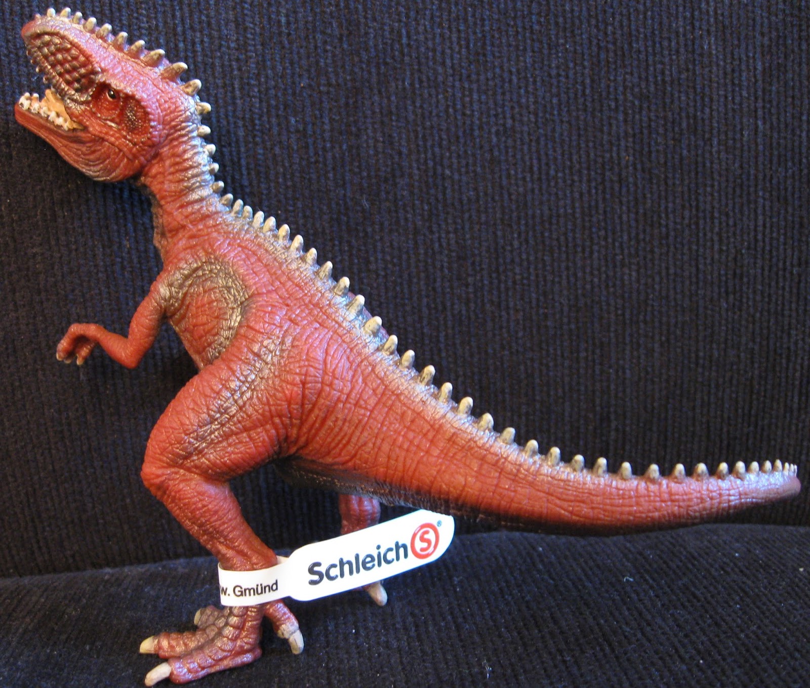
GIGANOTOSAURUS - Schleich "World of History" small version 2015


During the summer, Schleich released a series of small-version dinosaurs featuring all-new sculpts and dynamic, colorful paint applications. I have already taken a look at their "World of History" small version Velociraptor, Tyrannosaurus rex, Triceratops, Therizinosaurus, and Carnotaurus. Now, it's time to take a look at the final release: the small version Giganotosaurus.

It's interesting to note that, despite the fact that Schleich released a completely new large-size Giganotosaurus this summer, this small version looks nearly nothing like its larger self. That large version (reviewed in an earlier post on this site) is massively thick and solid, while this small version appears quite lithe, and is incredibly thin in terms of width. 

It's posed mid-roar, with a couple of the defining twists to the neck and tail that the recent releases have been sporting. Each hand has 3 fingers, with the wrists slightly twisted outwards. The mouth is open and the roof has some basic sculpting, while the tip of the tongue is curled upwards from the bottom interior. The mouth is pink, and the teeth are painted mostly well, individually.

The rest of the paint is applied well, with some highlight airbrushing, but it's honestly a paint scheme that I don't much like. The entire dinosaur is a deep crimson, which is ok, if not a bit interesting. The belly/underside and highlighting, however, is a metallic silver. Not grey, but silver. As in, reflective with little sparkly bits that catch the light. It does add a little flavor to a sculpt and design that I find pretty bland, especially in comparison to the new large version Gigano, but it's a bit too much of a stretch for me, personally.

The sculpt shows the same care and attention to fine detail that the other small releases have. There's some neat wrinkling at the neck where it bends inwards, and I like the profile of the head a great deal. The hands and feet are a tad soft, but the torso itself has a good measure of creases and wrinkling to add some depth.

Honestly, this is probably my least favorite of the new small version releases, right alongside the Velociraptor. It's not bad, but it really doesn't do anything to stand out in my display. There's a very generic quality to the whole piece, and I find the metallic silver to be too garish for my own tastes. That said, it may be eye-catching enough to capture the attention of a kid, which is who these are directed towards, anyway...


Friday, August 21, 2015

CARNOTAURUS - New Battat Terra Figure


My son, God bless him, found this terrific Carnotaurus for me last night. I stumbled across the Amargasaurus and Ceratosaurus Battat Terra releases some weeks back, but have never been able to find Carnotaurus, despite searching quite a few Targets. But, lo and behold, leave it to my 9-year-old to have the magic touch!

The figure is really cool, with a neat sculpt and toned-down paint. I like the splash of color across the throat, and the horns on mine look pretty good. The eyes are a little wonky (seems the pupils are an issue across the line), but the paint is otherwise great. I noticed a couple of odd things about the sculpt. First, the left foot is sculpted with the heel flat and the toes raised. It almost looks like the ties in the package have warped the foot, pulling the back down when it was meant to be up? Not sure, but it does look strange. The other interesting thing is how narrow the skull looks when viewed face-on. It's very different from the other Carnotaurus figures I have, and makes for a unique figure of a unique dinosaur. Since Battat is so well-respected for their accuracy, I'm going to assume that this is the correct look and my Schleich and Papo versions are too rounded. In any event, it's a cool figure.

The arms on this guy are also not swept back, as they seem to be on the other versions I have, but hang down. The tail curves downward to meet the base of the box interior.

Overall, it's great to have the Battat Terra Carnotaurus added to the collection. I've been fortunate to find all of the new releases I'm aware of, and hope that Target and the Dan Lo Russo Collection keep up with the re-releases far into the future!

Saturday, August 15, 2015

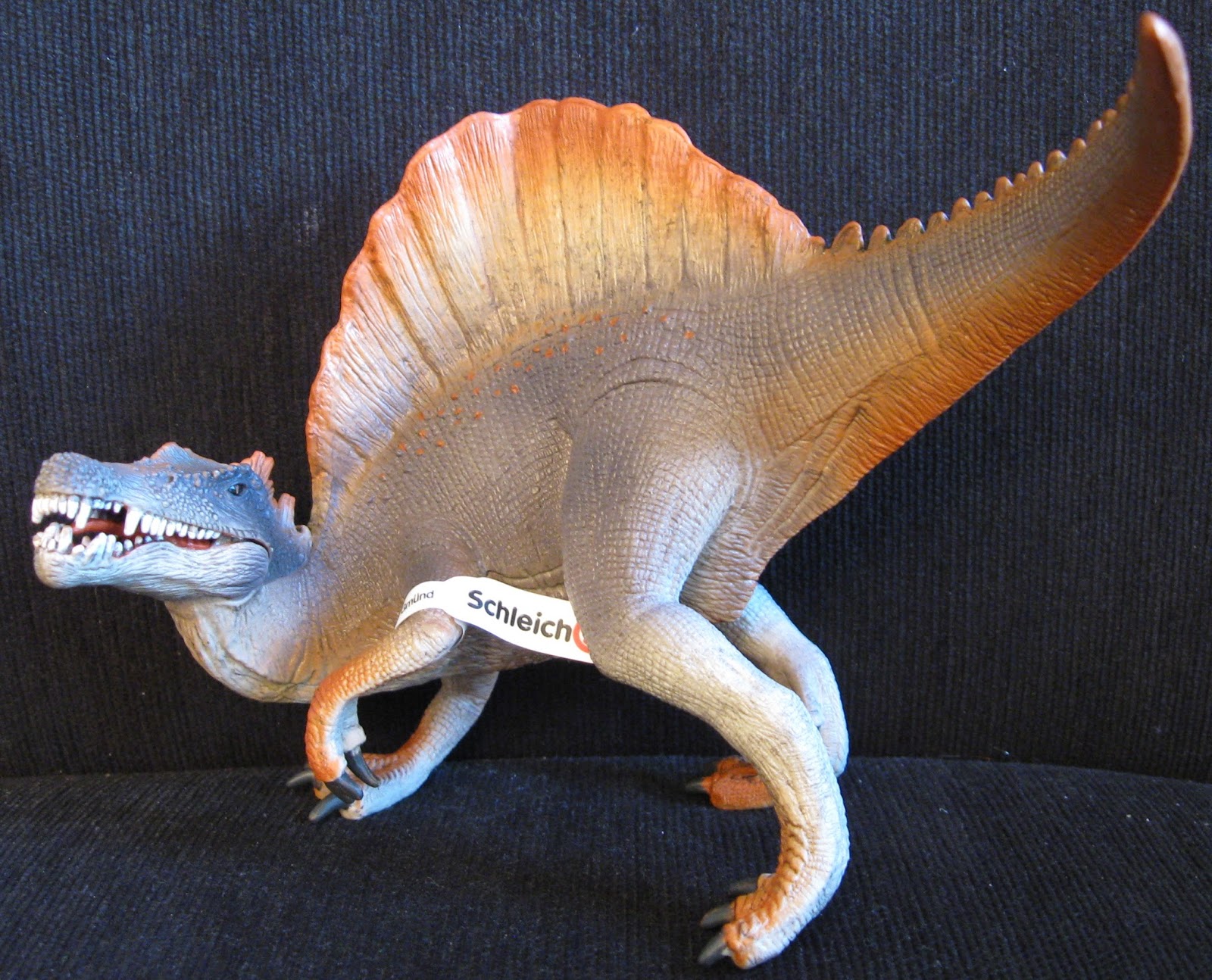
SPINOSAURUS - Schleich 2015 Large Size Dinosaur


Schleich's new Spinosaurus presents a striking look in nearly all aspects, clearly separating it from its previous incarnation. Where the earlier release sported drab colors, a basic pose and an uninspired level of detail, this new version takes all of those qualities to the extreme opposite...

Spinosaurus 2015 sports a lavendar color scheme with orange highlights transitioned with a lighter tan between. There are strategic scales painted orange along the flanks and along the top of the snout. The eyes are glossy black and the interior of the mouth is sculpted and painted a nice red. The teeth are individually sculpted and are painted well, though they are fairly blunt (understandable) and misaligned (though not as much as on the Papo Running V-Rex T-rex).

The jaw is articulated, but mine seems a little off at the hinge on the lower jaw (meaning that it isn't lined up perfectly).

The sculpt itself is really quite lovely. You can see all the fine details and variations to make the skin textures all across the snout. The nostrils appear to be placed about midway between the eyes and the tip, about where the ridges begin.

There's a noticeable seam where the top half of the head/neck is glued in place to seal the lower jaw in, but that's the price to pay for a hinged jaw.

The animal is sculpted pretty dynamically, with a really sharp twist of the head as well as the tail towards the left. The result is that the Spinosaurus only measures just under 7" long, while being about 6" tall at the top of its spine crest.


Another interesting result of the pose is the way the hands/feet/claws are done. There are three on the ground, and they are posed in a similar fashion, with the toes splayed wide. The final hand, the one up off the ground, has the fingers close together, and the result is that it looks much smaller, almost like it's out of proportion to the others. It's really not a big deal, but it is noticeable.

Schleich has also added another creative touch to the sculpt along the length of the sculpt. They've sculpted the individual plates of the spine to appear so they twist with the torso. They appear to overlap or flex as needed to accomodate the body. It's really neat, and adds a bit more to the dynamic nature of the pose.

I really like the new Schleich Spinosaurus. It looks great on the shelf and sports a seriously eye-catching design. I think kids would love the new look. Personally, I find the head sculpt a little too "dragon like" when viewed from the side, and with its mouth open, but it's otherwise a terrifically fun update. Much like with the new Giganotosaurus, the artistic license taken here serves to create a visual treat!


Scaled with Papo Standing T-rex.