Sunday, December 30, 2012

GOLDBERG - WWE Ruthless Aggression Series 6


There have been a lot of bad Goldberg figures done over the years (and I don't mean "bad" in the "good" way. JAKKS always seemed to find a way to goof his face scan, so I never bothered to pick one up, despite my enjoyment of Goldberg's complete and total domination in the ring. With my recent (slight) re-interest in professional wrestling ignited, I stumbled across a Goldberg I could actually accept, and this is it: JAKKS Pacific Ruthless Aggression Series 6...

I actually really like the idea of this packaging- clamshell front and back, so that MIP collectors don't have to feel cheated. The card itself is a mess of odd lines and colors- not sure what they were going for here, but the figure is shown off completely, fore and aft. This particular Goldberg comes with a red chair. Now, on to the main show.

This scan has appeared in several different incarnations of Goldberg, so search around and see what you can find. I've seen the black and white shorts kind, one with a Championship belt, and another without white trim on the trunks. They all share the same sculpt, though, complete with the same face scan, so any one would suffice- pick one with accessories you want and you're good to go!

As I said earlier, this is THE Goldberg figure for me. The face scan is good, the paint works well, and even the torso sculpt is mostly fitting. I've got some nitpicks to share, of course, but keep in mind that my overall impression of the figure is a good one.

I'll start with the sculpt itself. Goldberg was (is) immense, and though this figure is quite ripped, it's not quite perfect. Toy Goldberg's head is a tad too large for the body, a case which is emphasized by the photo included in the lower corner of the clamshell. I think it's got to do with his shoulders, actually. The figure's aren't quite big enough.

I haven't opened Goldberg yet, but I predict that he's going to have some trouble dropping his arms down any further than they are to his sides. It just looks like the shoulder ball is at its lowest point in-package, and his arms are out at like 30 or 40 degrees.

Finally, the hip articulation looks fairly restricted as basic cut joints without a whole lot of forward or backward movement. Of course, I could be wrong, and wouldn't mind being pleasantly surprised. Time will tell.

My last little nitpick is with the lack of elbow pads- the picture's got em, why doesn't the figure?


I'm really happy with this version of Goldberg. There are a few small things I'd tweak, but until Mattel decides to release an Elite version, this one will serve as the definitive Goldberg on my shelf.


Sunday, December 23, 2012

Brock Lesnar - Mattel WWE Basic Series 25 figure review


Brock Lesnar makes his first appearance in the Mattel WWE line with this Basic Series 25 figure. Lesnar comes on the new smaller cardback with a slim bubble and no accessories. He features standard male Basic articulation and measures about 7" tall. The sculpt is very good, with a strong likeness, though I find the hair to be blonder and less reddish than the real Brock's. Tatoos have their usual impressive Mattel crispness (one on each shoulder, the big one dead-center front and more on the back. The trunks are red and black with a sculpted line to separate. Looks like they are sculpted around the legs, so the knees can bend. The gloves are sculpted , as well, on the semi-clenched hands. With this figure, Brock Lesnar gets a solid entry into the Mattel WWE Basic line, with an Elite version soon to come!

WWE Eve Torres - Basic Series 25 figure

Truth be told, I bought the earlier Series 11 Eve Torres figure twice, and returned it to the store both times. There was something about the likeness that was just too far off for me at the time. I've since become more forgiving, and am now kicking myself for not keeping her. I decided to correct that mistake and make SURE not to pass on the new Series 25 Eve.

I honestly think a big part of the sell for that Series 11 Eve was the package photo. Just...wow. Well, Series 25 does much the same thing: I'm sold. The likeness on the figure is still a different story. It's not terrible, and she's not ugly by any means, but it really isn't dead-on by any stretch of the imagination. The forehead is a bit too high, the chin too pronounced, and there's something about the mouth that's a little "off" to me. The pink on the lips is startlingly pink, too.

The outfit, itself, (and the body, for that matter) is the same sculpt as the earlier Eve, I think, with updated paint to match the package outfit. White, with gold highlights and boots. "Believe" adorns the choker and the sides of the boots. It's all very well-done, but not being a huge WWE or wrestling figure-follower, I can't say anything about the accuracy.

Eve looks to clock in at about 6 & 1/2" in height. Her articulation looks great, with all the points the Elite guys have, and the Basics want. Without opening her up, I can't vouch for her neck articulation with all that hair, but I can make a pretty good guess.

Eve, Version 2, is a good-looking figure, and I'm sure any WWE fan will be thrilled adding her to their collection. I should mention that the card backs on this new Series 25 have been shrunk by about 1/4, which I don't mind. They look less wasteful and still fit the figures well, though it would be nice to get an accessory or two, even with the Basic line.


The Great Khali - Mattel WWE Best of 2012 action figure

I don't usually collect wrestling figures. I bought a precious few JAKKS Pacific figures back when I paid a little attention, during the hey-days of Stone Cold Steve Austin, The Rock and Triple H, but I've long since sold off any that I had in my collection. When Mattel got the WWE license, I re-visited the figures and purchased an Elite Batista. The figure looked great, but the ankles had the same floppy problems that my Masters of the Universe He-Man had. That, coupled with the exorbitant price-tag, was enough to kill my interest. I sold Batista off and haven't looked back...until now.

I don't honestly know what made me pick up The Great Khali- I think it was a combination of the great sculpt and his sheer size; this guys measures in at over 8" tall, dwarfing most of the figures in my collection! The head-sculpt is pretty great, with a strong likeness, clean paint and a few detailed wrinkles around the eyes and mouth.

For the most part, Khali is a fairly plain figure. His muscle definition isn't as pronounced as that of, say, Randy Orton, and he doesn't have any of the tatoos or a striking outfit to make him jump out at you from the shelf. What he does have is a pair of bright flourescent pants and an intimidating height. The word "Punjabi" is painted onto the outside of the pants legs in gold with black and white trim. Very clean and good-looking.

The Great Khali is made from a terrific feeling plastic. It's got heft to it, and the skin has a very subtle texture to it. The hair is soft and rubbery so as not to get in the way of the articulation.

Speaking of articulation, The Great Khali has a ball-jointed head with very little forward/backward tilt, ball hinged shoulders, swivel biceps, single pin elbows and knees, cut waist and hips, swivel boots, single pin ankles and swivel/pin wrists. It sounds like a lot, and considering Khali's billing as a "Basic" figure priced at about $10, it is.

But without NECA or DC Universe Classics style hips, he can't really take any dynamic stances below the waist. I know those are reserved for the much more articulated Elite Series of figures, but surely if the WWE Basic women can have those kinds of hips, the guys can, too?

The hands are posed in a semi-grip, with the right more open than the left. No accessories are included to grip.

The Great Khali is a neat looking figure. He certainly stands out on the shelf, and he's made solidly enough for any kid to enjoy punishing. At around $10 he's affordable, even if he comes absent accessories, and has done a good job of drawing me back into paying attention to the scads of wrestling figures I usually wander past...


Saturday, December 15, 2012

HALO 4 Warthog Die-Cast Vehicle Review - Jada Toys

Jada Toys has released a series of highly detailed Halo 4 Vehicles that I've only ever seen at Wal-Mart stores. The vehicles are made of a combination of die-cast metal and plastic, and include miniature figures, as well. Tonight, I'm taking a look at the UNSC Warthog Combat Edition.

This vehicle comes in a couple of different variations, having to do with the paint. The Collectors Edition has a high gloss dark green paint job, while the Combat Edition is a paler matte olive green (which I prefer). The vehicle comes packaged in an attractive window box which would be suitable for display on its own, since the contents are clearly visible from nearly all angles. This may be your preference, as getting this thing out of the packaging was one of the most frustrating experiences I've ever had. The pictures included here will attest to the fact that it CAN be done, but leave yourself a good 20 minutes, a sharp knife and plenty of calming techniques to do so (maybe the sharp knife isn't such a great idea after all).


The Warthog itself looks fantastic. It's about 7 & 1/4" long and 4" wide, and the paint and detailing work are exceptional. Mine has some green rubbed off at the edges of the UNSC symbol behind the front tire, but the lines and everything else are all crisp and clean. The cockpit has details right down to the speedometer and the gear shift. The gas cans on the back are a deep red, and most of the highlights are in silver or gray. The wheels (plastic, not rubber) rotate independently, but there is no suspension system. There are fine plastic rails at several points around the outer edges, which really add to the look. Just be careful, they push in very easily- I thought I broke bent one but it can just be popped back out again.

There are only a couple of real drawbacks, as far as I'm concerned, with this set. One is the turret. It comes out of the package bent and oddly angled. Not the end of the world. The next has to do with the paint. Like I said earlier, it's all really well done, neat and clean. That's the problem- it's almost too clean. This thing looks like it just rolled off the UNSC assembly line. Not a spec of dirt or weathering anywhere. Now, that's fine, but a little dry-brushing or airbrushed highlights could really have served to bring out the detail and add realism to an already realistic toy. The final issue has to do with the figures. Included are Master Chief and a Marine. Besides being really, really tiny (2" tall- never having played the game, I don't know exactly how they should stack up next to the vehicle, but standing beside it they look ridiculously small- just about the same height as the tires), their articulation is really, really delicate and difficult to work. I can't get any knees bent, but I did manage to get the hips to move enough for Master Chief to sit in the driver's slot (he's drowning in it- looks like a kid driving dad's car). The Marine won't budge, and his legs are stuck in an odd bend that makes it impossible for him to stand. If you care about the figures, you'll want to take this all into consideration. If you're like me, and don't care, it won't make a difference. I bought this set for the Warthog- it'll be displayed sans figures- and as far as that goes I'm really impressed. For $15 bucks, you get a solid, hefty and detailed die-cast Halo Warthog that looks terrific on the shelf. I haven't opened any of the other sets, but if they look this good I'm going to be a happy camper...


Tuesday, December 11, 2012

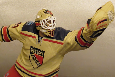
HENRIK LUNDQVIST - McFarlane NHL Series 32 Figure Review

Being a New York Rangers fan is oft a painful experience. Years of anguish and heartbrake, with desperate hopes pinned on a chosen few. I've been following the Rangers for over 30 years, and that ought to say enough. Beloved among the (often) cursed is the venerable stalwart, King Henry, the Saving Grace. I never had a chance to get the Series 13 Henrik Lundqvist figure- I never even saw him in the stores- and I've often regretted it. So, needless to say, I was anxiously looking forward to the new Series 32 version. There may be no hockey, but we've still got hockey figures...
What you see is exactly what you get with McFarlane's Henrik Lundqvist. He's a slightly posable statue done in a 6 or 7 inch scale. Articulation gives you swivels at the neck, shoulders, "wrists", and the tops of the pads. They are enough to tweak the pose slightly, changing the personality of the "save" a little. As far as the pose goes, it's a good one. Very Lundqvistesque. The details and paint are stellar (mostly)- very crisp and well-defined. You can even see the scruff under Henrik's chin beneath the mask! I had an odd initial reaction to the figure the first time I saw it in person. The uniform is not white. It's more a vanilla, or light beige. I also noticed black grease lines under Lundqvist's eyes, which he doesn't wear. It's unlike McFarlane to botch accuracy to such a degree. I was even more puzzled because the stick and the mask highlights are very CLEARLY white. It wasn't until I noticed the sticker at the bottom front of the package that I understood: this is Lundqvist as he appeared at last year's WINTER CLASSIC. Yes, the uniform was off-white, and yes, he wore eye grease because it was an outdoor game. Kudos to McFarlane!

I've got a couple of very small gripes with the figure. Getting him attached to the stand was a real bear. The pads just don't level out enough to get the steel peg in the left one into the hole properly. I actually left the right pad off the base, attached the post, then swiveled the right pad into place. His legs still put a lot of opposing pressure on the base, which warps if he's not positioned just so. You'll also notice a lot of black smudging on the stick blade. I think it's there intentionally, but it doesn't look great. It isn't a natural look- more like someone slopped some paint there than scuff marks from the game. Finally, the string attachments at the collar of the jersey are painted in place. I think asking for a sculpt would have been too much, and the jersey itself may have even had a painted stringing at the collar, but it just looks too symmetrical to be realistic.

Otherwise, love my Lundqvist figure! Finally! This guy was WAY overdue in the NHL Lineup from McFarlane- and I've especially grown to love that this is a unique deco from a one-time game. Giroux (I think) is part of this series, as well, so you can set up a Winter Classic showdown rematch any time you want. McFarlane has released a harder-to-find blue jersey variant (yes, I want), as well...

Friday, November 23, 2012

SPARTAN EOD with MONGOOSE - McFarlane Toys HALO REACH Boxed Set Review

I have a very odd relationship with Halo Toys. I've never played any of the games, but I've read several of the novels, a handful of graphic novels and seen a pair of Halo movies. What I've seen, I've liked. That goes for many of the toys, as well. Jada's vehicles are honestly terrific, and I've even made the plunge with a few Mega Bloks sets, some of which were good (Mongoose), others terribly bad (UNSC Hornet). I seem to fade in and out with McFarlane's offerings, as well. They look great, and every so often I just can't help myself, so I have a handful of figures: Tartarus, Brutes, a half dozen Master Chiefs and others. At one point, I must have had a dozen assorted Spartans, which I have since sold off. See, after the initial excitement wears off, the McFarlane figures kind of fade into the background of my collection, and are forgotten. At least until a new batch is released and the cool factor grabs hold of me again...
We'll start with the Spartan EOD figure: holy cow this guy is awesome looking! I actually have the older version EOD (cyan) with Mongoose, and this Reach version absolutely blows that one out of the water. The sculpt is brilliant from head to toe. The paint, weathering and tamps are all fantastic: there's loads of fine detail in each and every aspect. McFarlane increased the Halo figures in size for the Reach line, and man does it make a difference!

The EOD Spartan stands 5 & 1/2" tall, and features a helmet that brings to mind the design of the original Stormtroopers from Star Wars, which may be one reason I like it so much. He comes with sculpted pouches and packs across the chest, and a knife in its sheath on his left shoulder. The shoulder armor is mismatched. Proportions seem very good, and the only odd-looking spot to the sculpt is in the lower torso area, which seems thick and bland, giving it a diaper-ish appearance.

The articulation is superb, as well. The recent Halo figures I own have the best ball-jointed heads of any action figures. If only Mattel could figure out how to do this! The shoulders, elbows, wrists, knees, and ankles all feature clicky ball-joints, which allows them to hinge and rotate effectively. Yes, the elbows are restricted by the armor, and the "across the chest" arm poses can be difficult to get to look right. There's a torso ball and some interesting hips which allow for forward, backward movement as well as rotation. It's all standard to the Reach line. I found that the more I worked with posing the figures, the easier it became to do- just takes a little getting used to.

The EOD comes with an amazing rocket-launcher. The detailing, paint and highlighting is really as perfect as can be. It feels a little fragile (especially around those thin grips), and that, combined with the hard, inflexible plastic of the figure's hands, makes getting the launcher into his mitts a challenge...
The final piece in this magnificent package is the Mongoose, itself. It measures about 6 & 3/4" long, making it bigger than the previous Mongoose I own. The detailing is far superior, as well. Added sculptural detail to the front, treads, and even the seat itself, make this a far more lifelike replica. The treads are highlighted with a silver brush, which seems odd to me unless they are supposed to be made of metal, but I saw an ODST version in the store with mud-spattered treads and it didn't look as good as this one, so who am I to question, right?
The Mongoose is done in a blue that perfectly matches its Spartan rider, highlighted with a light drybrushing. The look is terrific, but the wheel wells are devoid of matching detail, and the undercarriage doesn't have the same level of weathering. The result is a good "overall" look, but an odd dichotomy of toy vs. model when scrutinized more closely. The wheels all spin independently, and the handlebars turn (no effect on the wheels, though). There are two foot pegs that fold down and a folding seat behind the driver as well as a fold-up platform for a standing Spartan. The Mongoose is an excellent vehicle at this scale, more realistic in appearance than most vehicle toys as a result of the drybrushing. It's not perfect, but in tandem with an awesome action figure and his accessory, it's quite satisfying.
Many things I read online disparage McFarlane Toys. Comments and reviews seem filled with disdain or downright dismissal. It's unfortunate. McFarlane Toys has made a series of blunders, yes. The Prince of Persia and Walking Dead figures almost seem to be coming from a different company. My opinion is that McFarlane Toys does still have an A-game, and it's Halo. They are so focused on their largest property, that the other lines seem to be handled by some B-team. So, while those lines are easy to dismiss or scoff at, doing so to the Halo figures would be a big mistake. This set is one of the best action figure/vehicle pairings I have ever bought. The figure is fantastic, and it's supported by a great accessory and a nicely managed vehicle. The sculpt, paint, attention to detail and articulation on both are superior, and well-executed. Quality control is still spotty, even with the Halo line, for McFarlane, but I'm happy to say that everything here is working quite well, straight out of the box. If you can manage to find this box set, my advice is to not pass it up. I don't think you'll be disappointed...


Monday, October 29, 2012

Play Arts Kai - God of War 3 KRATOS - Square Enix review

I've been trying very hard to restrict my Play Arts Kai purchases to Batman and Street Fighter characters, simply because of their cost. So I initially passed on their God of War Kratos figure. But after stumbling across one in a local toy store, I found I just couldn't pass him by...

Kratos comes in a sturdy window-box with a velcro cover flap. The packing is exceptional in every way: the box art, both on the front and back, is terrific. The box itself is sturdy and offers very little wasted space. The inside flap includes a ton of text outlining Kratos' back story in detail. 

The figure and accessories are held securely in place by a clear inner cover tray. No twist-ties at all. And everything is shown off perfectly through the window. The package does just about everything you could want it to, and does it well. The only down-side here is for MIB collectors who want to be able to see the figure through the window on the shelf- since a flap has been added, that can't be done. I like the "window only" look for the Street Fighter figures, but I think I prefer the "flap" for Kratos.


Kratos comes with a nice set of accessories. Included are: 2 open hands, 2 gripping hands, 2 Blades of Chaos (or Exile?), 2 sets of metal chains to hook into the Blades, and 2 Claws of Hades, along with a small gray post which can be used to attach the weapons to a hole in the figure's back. The Blades are beautifully sculpted and painted with an awesome level of detail from pommel to tip. The chains add a lot to the look, and plug in relatively easily. It took some work getting them into the gripping hands, but once there, they are thoroughly snug and secure.
The Claws look great, as well. They are full of fairly sharp spikes. No rubbery plastic here - these were clearly not made by Bandai. The gunmetal color is highlighted with purple airbrushing. They are nicely done, but probably won't be getting much display time other than being plugged into Kratos' back.

Like many of the Play Arts figures, Kratos looks awkward to me in a "vanilla pose". The Play Arts sculpts try to work most effectively with the articulation. This serves the figures VERY well in dynamic action poses, but standing straight with arms down at the sides aren't as aesthetically pleasing. For instance, the neck is thick and overly long with an over-abundance of detail. The shoulder and elbow joints are ugly. The hips don't usually want to sit symmetrically, and the abdominal muscles are overdone.

Once he's posed, however, almost all of the awkwardness disappears: Play Arts Kai figures are definitely meant to be displayed out-of-package! And the Play Arts articulation model suits Kratos well. The double-jointed knees allow for some great bend, though I still can't get the crouch low enough for my tastes. But once you figure out how to get the joints to work together, he's a blast to play around with.

Kratos has: ball-jointed head (tilt down is better than up), neck, ball shoulders with a forward/backwards slide, bicep swivel on the left arm (can't get the right one to rotate due to the Golden Fleece armor), ball elbows, ball wrists, chest crunch and swivel, waist crunch and swivel, ball hips, double knees and ball ankles. The sculpt of the skirt allows the thighs some room to move, while still looking natural.

Once he's got his weapons in-hand, Kratos looks great! The sculpt is full of fine details: plenty of creases, wrinkles, scars or whatever. The belt and skirt in particular are awesome. The Golden Fleece Armor is a little softer on detail, though it's a nifty golden color with airbrushed highlights. The shin and forearm armor and knicked and dinged, and he's even got bandage wrappings around his upper thighs.

For me, the weakest part of the entire figure is the face. I think the sculpt is ok, but the paint is more of a hindrance than a help. First off, I agree with the main complaint from everyone who seems to have this figure: the airbrushed gray across his forehead and cheeks is too dark; it needs to be subtler to work well. My other main disappointment is with his expression. Play Arts Kratos doesn't look "mad enough"- he's got a bland look, and I think it mainly has to do with his mouth. In the prototype pics I've seen, his mouth was sterner, grimmer, thinner and not painted red! The final figure wears a wonderful shade of red lipstick which doesn't quite make it from edge to edge. His jawline also flares out a bit, giving him a squarer rather than angular look. I think NECA captured the likeness much better, and the black lips and furrowed eyebrows on their version are much more wicked...

NECA Kratos
Side by Side


NECA Blades

NECA Fleece
Play Arts Kai has created a terrific, highly poseable Kratos figure. He's a lot of fun to play around with and pose. The sculpt isn't as strong as NECA's, but he's way more likely to strike a game-familiar pose. NECA's Kratos does an exceptional job as a statue, but Play Arts has created an awesome action figure...

Saturday, October 20, 2012

TMNT April O-Neil : A kid's perspective review

This review is courtesy of my 8-year-old: "April O'Neil is my favorite character in Teenage Mutant Ninja Turtles show, so I decided I wanted to get her and I already had Donatello so I thought they were a good match (Donatello falls in love at first sight). April is exactly four and a half inches (same height as Donatello). She has 8 weapons: A gun, two stink bombs, two boomerangs, a sword, a stick sword, and a bo stick.

She has four joints: a head swivel and wrist swivels (she actually has more- twist at the neck, ball shoulders, cut wrists and waist, along with odd ball hips; it's more, but still not nearly enough). Her right hand is open and her left is for holding her weapons.

Her boots are a little too big, but that way she can stand on her heels or toes. I like the way that they did her hair so it looks like it's swaying in the wind. I also like the "5" on her shirt.

I don't like the fact that her knees don't bend and her elbows don't bend (see, toy companies? Even an 8-year-old wants knee and elbow joints!!!), but all and all I really, really like the figure.