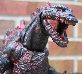
 Shin Godzilla looks pretty cool standing in his standard marching pose. The sculpt (other than the head proportions and the interior of the mouth, which is sorely lacking) is generally strong. The crevices and folds are deep and sharp, with good paintwork to support the look (the red seeps up from underneath effectively). The spines are a bit too candy-apple red for me at the base, personally. The tail is interesting. It comes in several separate pieces that are sharply angled where the ball meets the socket. The interesting part is that they are angled in the opposite direction than I thought they should be. As a result, the tail has some sudden reversals in direction. Like the spines, the tail tip is too red, the sculpt is poorly defined and there's a sloppy black drybrushing made worse by some sloppy random dabs of orange paint. For me, the tail tip is probably the weakest part of the sculpt. Incidentally, the feet and toe claws look awesome, but Shin Godzilla's random claws all over his feet are absent on this version.
The articulation is there, but unfortunately I can't really get much use out of the joints. My figure's right arm doesn't want to move at the shoulder, and it seems very asymmetrical with respect to the left one. The assembly of the chest piece seems a bit tilted, and one leg moves very differently than the other. I'm also wary of messing with the tail too much for fear that it will come apart at the attachment points. As a result, I don't try to pose this guy much. I've got him in a basic, standing upright, faced forward pose, and that's how he's going to stay.
I just realized that I'm pointing out so many negatives, it might seem like I don't like the figure, which would be the opposite of the truth! I do like it, actually. I appreciate the details of the body sculpt, and I like how gloss has been applied to specific areas, like the toe claws and the red undercoat. It does a lot to bring the figure to life. I like the choice of materials: it's a really solid, heavy figure that could put up with some play, while keeping the dorsal fins nice and soft (do be aware, though, that there are some REALLY sharp edges to the body's hard plastic sculpt which might be tricky for young kids - you might want to check it out closely before handing one to a little Godzilla fan). The figure is light years ahead of the typical Bandai America vinyls, and the biggest positive NECA has going for these figures is the price point. It's priced right (though it seems to be creeping up as of late) at between $20 and $25. I haven't heard much from NECA about moving forward with their Godzilla line, other than that they want to. It would be a shame to see the line end, as they do look pretty cool all lined up alongside one another on the shelf, and they are a real cost-efficient alternative to the bloated overpricing of the S.H. MonsterArts line.


No comments:
Post a Comment